UX Study
Simplifying How Users Find Documents
Document Search Page Redesign
Web App

Introduction
An outdated search system made it difficult for users to access the documents they needed. Results lacked relevance and clarity, especially for non-technical users. The redesign focused on improving usability while working within technical constraints to deliver immediate improvements and plan for future enhancements
My role
Audited the existing platform and documented key usability gaps
Benchmarked filtering and result design patterns from tools like Notion and Google Scholar
Created multiple design variations based on user feedback and feasibility reviews
Project Timeline
3 Months
Problem statement
The existing search experience was unintuitive and lacked transparency, making it difficult for users—especially non-technical ones—to find relevant information efficiently. Poor result relevance, unclear filtering, and limited feedback on match logic led to frustration and frequent usability concerns
Common Pain Points

End User 1
“There are too many irrelevant results.”

End User 2
Search operators exist, but they’re too complicated

End User 3
“I don’t know if my keyword is in the title or buried in the document.”
Research Findings
We didn’t have any analytics or tracking tools to measure search usage, drop-off, or behavior patterns. Instead, we relied on client calls and UAT sessions to learn directly from users
01
Most users weren’t tech-savvy
02
Some had incorrect platform configurations affecting search
03
But overwhelmingly, the problems were with platform UX, not user behavior.
Current Search Experience
Before diving into finding solutions, I conducted a UX audit to understand how the existing policy search system functioned across different user types and access points. This helped surface core usability issues and system limitations.
Key observations from the audit:

Multiple Entry Points
Users could access search from three different locations, but all routes used the same logic—resulting in inconsistent experiences despite a shared backend.
Search Logic Lacked Clarity
The engine matched keywords across multiple fields (title, description, attachments), but users had no visibility into where the keyword was found in each result.
Overloaded, Unstructured Results
Search results were presented in a dense table view with minimal hierarchy, making it hard to scan or assess relevance at a glance.
Limited Usability of Advanced Search Operators
Advanced users could apply search operators (+, –, *), but most users didn’t know they existed or avoided them due to their complexity.
Possible Solutions
We explored several UX upgrades to make results more transparent and usable:

Quick filters
Easier scanning of documents
Text preview from files
pulled from PDF or Word content with highlights

Match location indicators with match counts
showing how many keyword hits per section
These were high-value improvements—but came with major performance costs due to the way our search backend handled indexing and result rendering
Initial wireframes
We explored several UX upgrades to make results more transparent and usable:
Search area
Apply filters
Search results
#1
Experimenting with Page layouts

#2
Attempt to fit in all the features we liked ( and FAILED)
Overload of information for normal users who only expect to see the results against their keyword

Designing for Different User Roles
The original search experience was designed with admin users in mind, but feedback showed that end users struggled with unnecessary complexity.
🧩
Problems
End users saw too much internal or irrelevant content like manager only comments, attachments etc
The layout was cluttered and not optimized for casual/non-technical users.
Admins could technically configure visibility—but few did, and the default was overwhelming.
💡
Our Approach
Designed a separate view for end users in Phase 1.
Collaborated with the product owner to define what content should be excluded.
Focused the layout on core policy content only: title, date, and document preview.
Dropped the idea of admin-customizable filters for end users after client testing showed it added confusion
Next steps
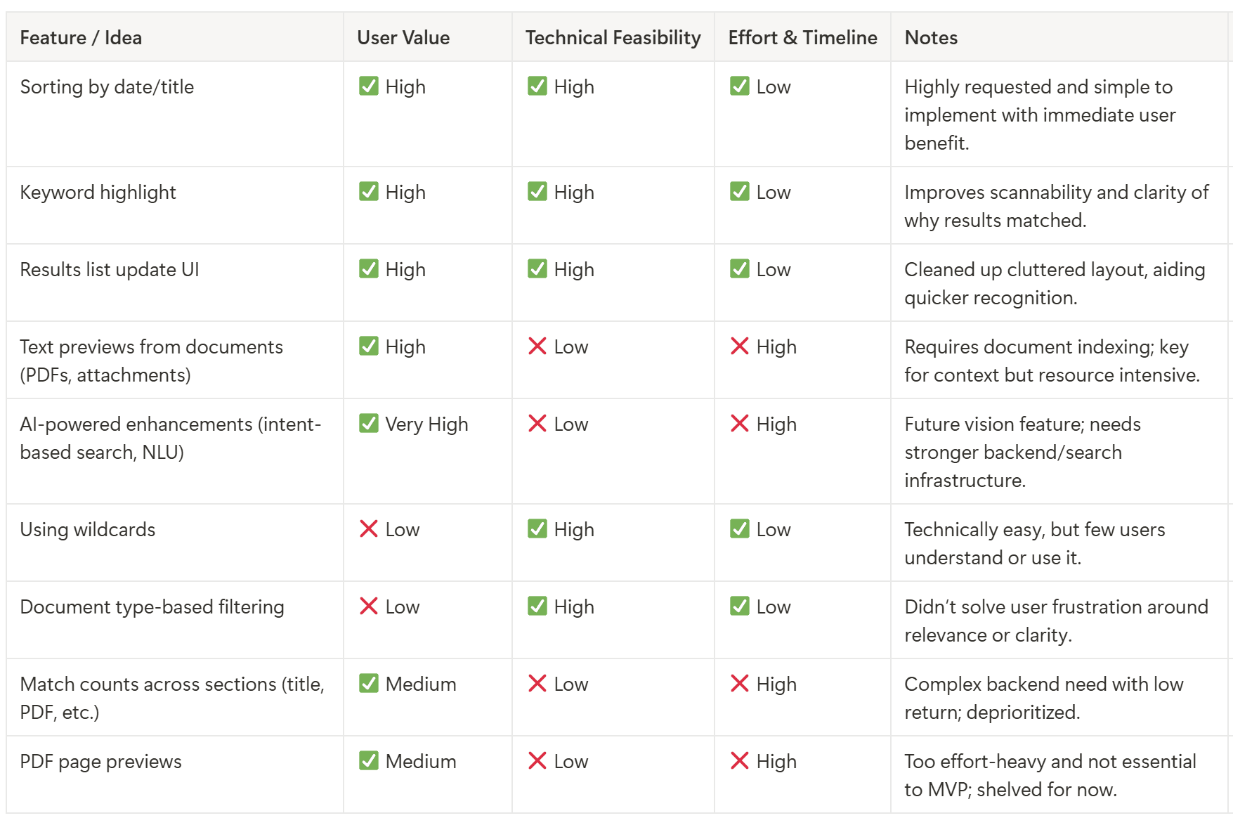
To move the search redesign forward without overloading the product and engineering teams, we used a structured decision-making framework grounded in real user value, feasibility, and delivery scope.
We evaluated each proposed solution against three core criteria:
👤
User value
Does this directly solve a known pain point
⚙️
Tech Feasibility
Can this feature be implemented with our existing backend & indexing structure
⏲️
Effort & Timeline
Is this something we can deliver within the 2-month MVP sprint window
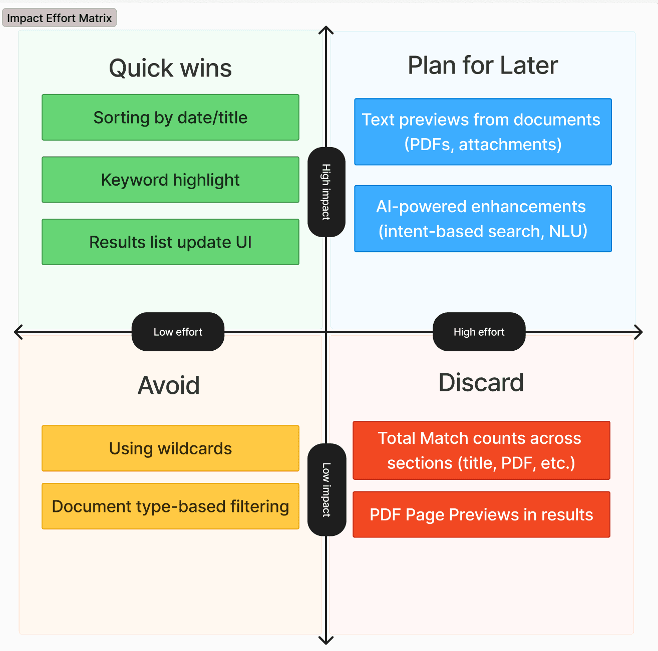
Impact Effort Matrix
What we shipped in phase 1
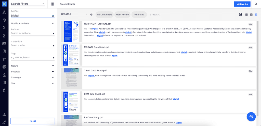
We launched a lean, faster, more intuitive search experience:
Google-style result list with snippet previews
Basic filters for folders, dates, and policy type
Simple, clean layout that removed visual clutter
This design didn’t solve everything, but it tackled the top user frustrations immediately—without overloading the team.

Planned for next phase

Plan for Future using AI capbilities

What I Learned
Great UX isn’t about perfect flows—it’s about knowing when to simplify
Even without usage data, client feedback can guide smart decisions.
Having clear design trade-offs helps move fast without losing quality.
Starting small with a strong UX base is often the smartest way forward.
Reflection and Impact
Improved clarity and reduced friction in the search experience
Delivered quick wins without overloading the system
Live with positive client feedback
Roadmap ready for future AI-powered upgrades