UX Study
Improving document search experience
Web App

Overview
Role: Senior Product Designer
Product: Enterprise Healthcare Compliance Platform
Surface: Policy Search (Highest-Traffic Screen)
Users: 10,000+ (workforce staff & compliance teams)
Scope: Structural & Experience Modernization
Timeline: 3 months ( Phase 1)
Problem Statement
The existing search experience lacked clarity and consistency, making it difficult for users, particularly frontline staff to retrieve relevant information efficiently. Inconsistent relevance ranking, unclear filtering structure, and limited transparency into result logic created friction and reduced confidence in the system.
Summary
This project began as a UI project but evolved into a strategic search modernization initiative.
Two enterprise healthcare clients escalated concerns and tied search performance to contract renewal discussions.
Through research, stakeholder influence, and phased execution, we reduced policy retrieval time from 3–6 minutes to under 1 minute and restored confidence in search — laying the foundation for semantic and global search evolution
Business Context
The platform supports 10,000+ healthcare professionals across multiple facilities.
01
An enterprise compliance platform supporting policy management, audit readiness, and regulatory governance across healthcare facilities
02
~80% of users are workforce consumers performing thousands of monthly document searches
03
Search reliability is critical to audit readiness and compliance. When users cannot locate the correct policy quickly, organizational risk increases
The Core Complaint

End User 1
“There are too many irrelevant results”

End User 2
“My keyword result appears on the 8th page, it should be on the first”
End User 3
“Search operators exist, but they’re too complicated”

End User 4
“I don’t know if my keyword is in the title or buried in the document”
Initial product team ask
“The UI feels cluttered. Let’s refresh it.”
Investigation
To understand the issue holistically, I structured the investigation using the 5W1H framework.
👤Who is affected?
Workforce staff (70%+ of user base)
Compliance managers
Auditors and reviewers
Admins
Frontline users were most impacted during real-time task
❓ What is happening?
Relevant policies not ranking first
Broad queries return 50–60+ results
Users must scan multiple pages
Correct results exist, but prioritization fails
⏰ When does it break down?
Daily operational use
Pre-procedure references
Audits & compliance reviews
This was recurring friction, amplified in high-stakes moments
📍 Where does the
breakdown occur?
Within search ranking logic
In relevance scoring & result ordering
Before results are rendered to users
Breakdown occurred at the ranking layer, not data accuracy
🤔 Why is this happening?
Structural Causes
Pure keyword based scoring
Ranking logic misaligned with user intent
No intent/context based prioritization
Experience Causes
Weak visual hierarchy
Cognitive overload in results layout
🔧How are users compensating?
Heavy reliance on filters
Deep pagination scanning
Admin validation requests
Content modified to improve discoverability
Insights
Our research methodology involved multiple feedback interactions with users:
1-1 interviews
20 clients
Group session
80 users
Usability sessions
12
Support ticket analysis
38
Escalation review
Sales team
These interactions revealed the top 3 usage habits and expectations:
01
Users search in plain language, not policy titles
02
If a result doesn’t appear on page 1, users assume it doesn’t exist
03
Speed matters more than advanced filtering
Symtoms validated
Too many irrelevant results
Poor ranking logic
The search results look very old school
Content-heavy results layout
Zero results for minor spelling errors
Delayed document indexing
Lack of confidence cues in result validation
In usability sessions, users took 3–6 minutes to find the correct policy
Strategy Shift
The Initial Direction
Leadership initially proposed a visual refresh of the search page as part of a broader UI upgrade initiative. The assumption was that improved layout and styling would address usability complaints.
However, the data suggested otherwise and we reframed the project objective from:
How do we improve the UI
to
How do users get the correct result every time?
Execution Strategy
To mitigate renewal risk quickly while modernizing structurally, we split into two coordinated track
Engineering Team
Search Engine
OBJECTIVE
Make the most relevant policy surface first
Ranking Refinement
Index restructuring
Auto correction of typed keyword
UX Team
End-User Experience
OBJECTIVE
Increase trust in the first result
Simplified results hierarchy
Reduced filter dependency
Strengthened visual scanning cues
Optimized default sort behavior
Designed for majority-use case
Audit existing search experience
Before defining solutions, I conducted a UX audit to assess how the policy search experience performed across different user roles and access contexts. This analysis surfaced key usability gaps and underlying system constraints
Key observations from the audit:
Multiple Entry Points
Users could access search from three different locations, but all routes used the same logic—resulting in inconsistent experiences despite a shared backend
Search Logic Lacked Clarity
The engine matched keywords across multiple fields (title, description, attachments), but users had no visibility into where the keyword was found in each result
Overloaded, Unstructured Results
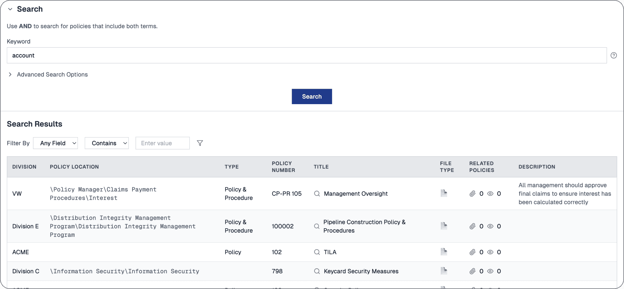
Search results were presented in a dense table view with minimal hierarchy, making it hard to scan or assess relevance at a glance
Limited Usability of Advanced Search Operators
Advanced users could apply search operators (+, –, *), but most users didn’t know they existed or avoided them due to their complexity
Benchmark competition & industry standards
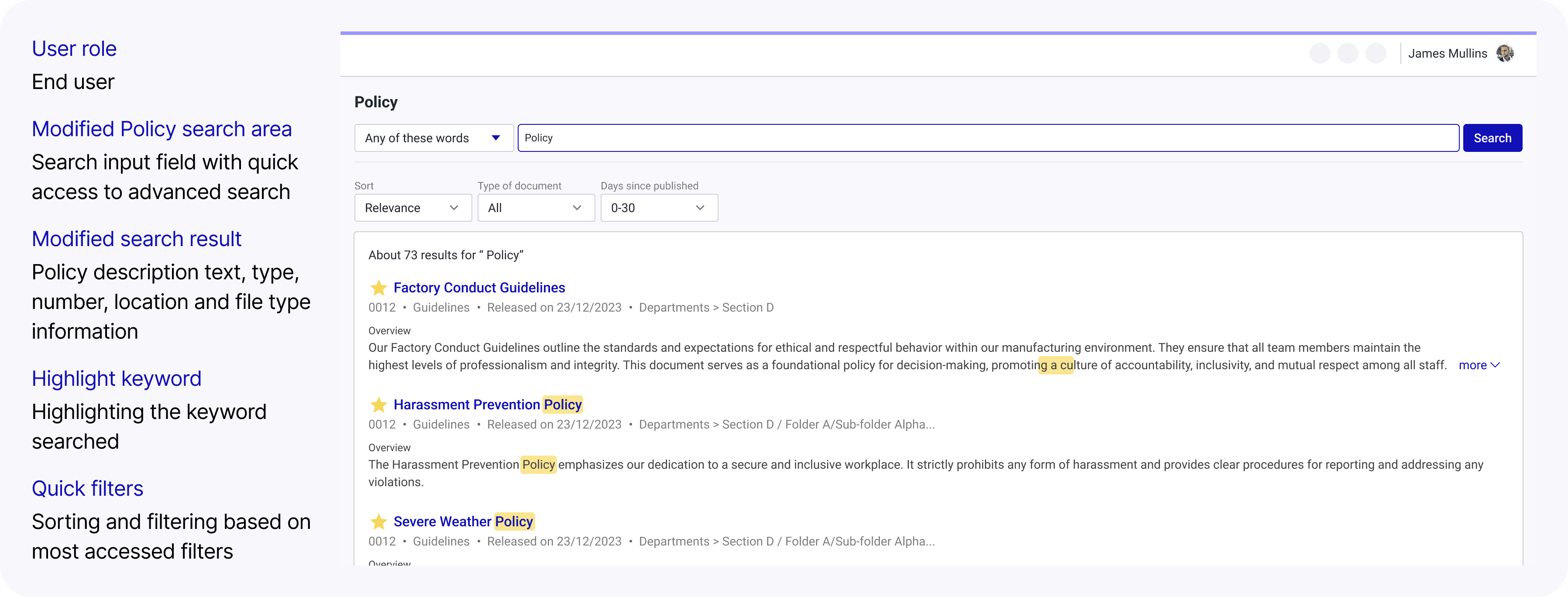
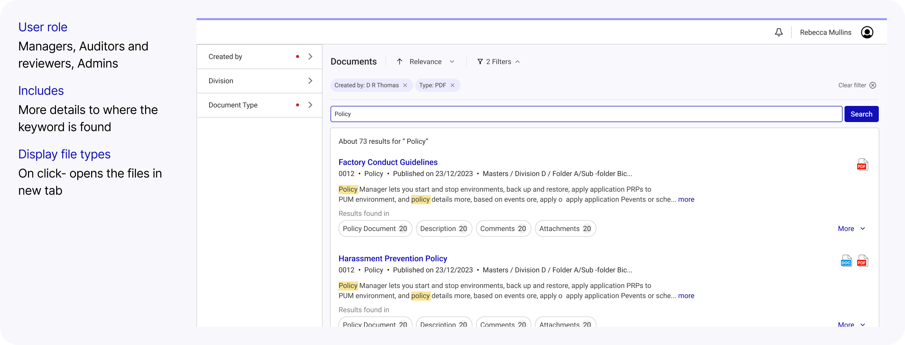
We explored several UX approaches to make results more transparent and usable:

Quick filters
Easier scanning of documents

Text preview from files
pulled from PDF or Word content with highlights

Match location indicators with match counts
showing how many keyword hits per section
These were high-value improvements—but came with major performance costs due to the way our search backend handled indexing and result rendering
Create user experience iterations
We explored several solutions to make results more transparent and usable
Search inputs
Filters
Search results
#1
Experimenting with Page layouts
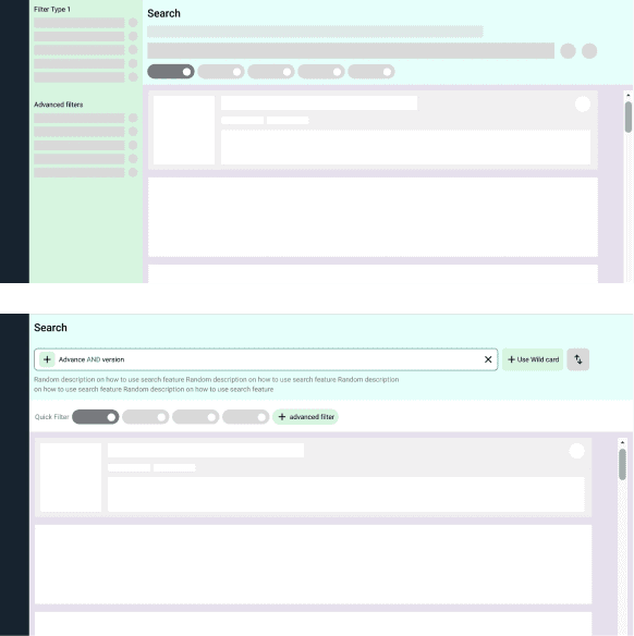
#2
Attempt to fit in all the features we liked (and REJECTED)
Overload of information for normal users who only expect to see the results against their keyword

Defining the final solution parameters
The original search experience was designed with admin users in mind, but feedback showed that end users struggled with unnecessary complexity
🧩
Problems
End users saw too much internal or irrelevant content like manager only comments, attachments etc
The layout was cluttered and not optimized for casual/non-technical users
Admins could technically configure visibility—but few did, and the default was overwhelming
💡
Our Approach
Designed a separate view for end users in Phase 1
Based on research and Collaboration with the product team to define what content should be excluded
Focused the layout on core policy content only like title, date, and document preview
Dropped the idea of admin-customizable filters for end users after client testing showed it added confusion
Next steps
We used a structured decision-making framework grounded in real user value, feasibility, and delivery scope. We evaluated each proposed solution against three core criteria:
👤
User value
Does this directly solve a known pain point
⚙️
Tech Feasibility
Can this feature be implemented with our existing backend & indexing structure
⏲️
Effort & Timeline
Is this something we can deliver within the 2-month MVP sprint window

Impact Effort Matrix

Phase 1: UX workflows for key pain points (Delivered)
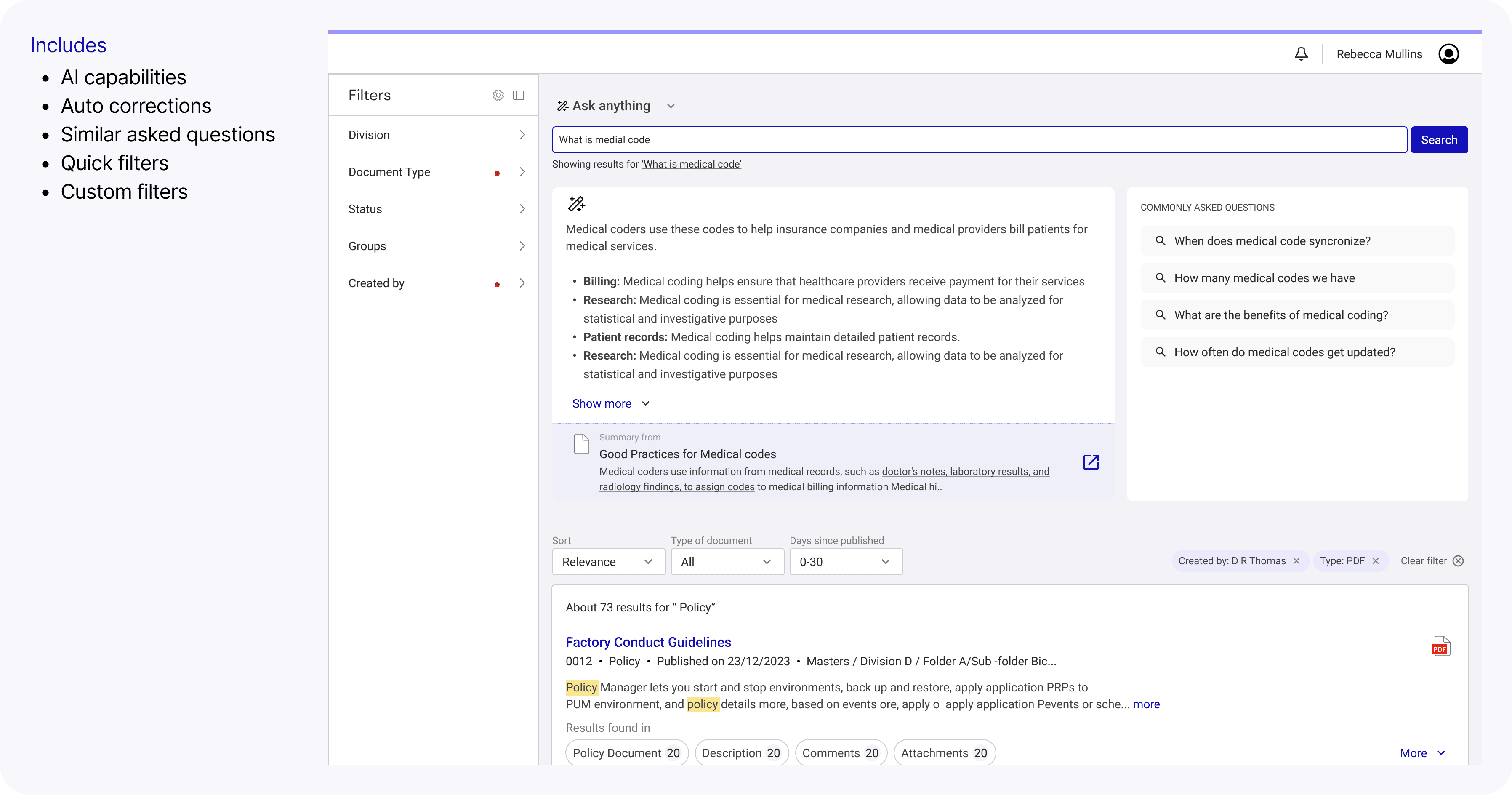
We launched a lean, faster, more intuitive search experience:
Google-style result list with snippet previews
Basic filters for folders, dates, and policy type
Simple, clean layout that removed visual clutter
This design didn’t solve everything, but it tackled the top user frustrations immediately—without overloading the team.
Phase 2: UX workflows for secondary personas (Planned)
Future: AI search capabilities
Learnings
Deep investigation prevents solving the wrong problem
Even without usage data, client feedback can guide smart decisions
Designing for the dominant workflow improves confidence at scale
Some UX problems require structural, cross-functional solutions — not just UI improvements
Impact
Mitigated renewal risk
Reduced search-related escalations
Faster document retrieval
Reduced cognitive load
Created foundation for future intent-based improvements